
We're excited to share that RentVision's monthly report is getting a much-needed new look.
If you've partnered with us for a while, you've gotten the same monthly report for years now. While functionable, we felt that, over time, it wasn't as helpful as first intended because it just showed your data without context.
Most analytics reporting you see only shows different sets of data, but numbers don't tell the whole story. How do you know if your marketing and leasing numbers are good, bad or average?
That's why we updated the design of the RentVision monthly report to make it easier to evaluate your most important analytics, as well as to give you better context into the true performance of each of your apartment communities.
This updated report will be sent to your inbox on the first day of each month. If you're listed as a regional manager or executive for your property management company, your report will include all of the apartment communities in your purview, and you’ll be able to easily navigate through the data for each property by using the navigation feature inside of the PDF. Members of on-site teams will get a similar report but only for their individual property.
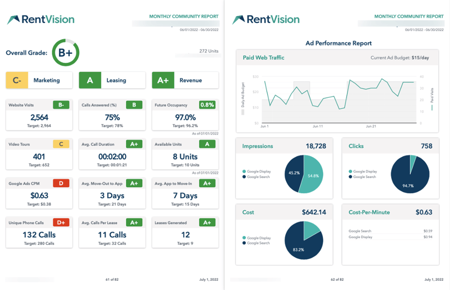 The new look of RentVision's monthly report.
What's new in the RentVision Monthly Report?
The updated report for each apartment community is a two-page PDF document. The first page shows an overview of your marketing and leasing from the past month, and now includes a new category focused on revenue if your apartment community has the Future Occupancy integration turned on. This new section is really beneficial because it gives an objective view of your performance, which is helpful in diagnosing areas of concern in your marketing or leasing.
The second page breaks down the performance of each of your advertising sources, providing insightful information on the amount of paid web traffic generated in the past month, as well as impressions, clicks, overall cost, and Cost-Per-Minute. (Read our blog post about how Cost-Per-Minute is calculated and why it's a vital metric for apartment marketers.) This helps you see exactly where all of your advertising dollars were distributed and how effective they were.
We've broken up the various sections and their cards to align the typical leasing journey of a prospective resident. They visit the website (Website Visits), watch a walkthrough video tour (Video Tours), call the leasing office (Unique Phone Calls), your agent answers (Calls Answered %)...and on down the line. We thought organizing each of these metrics in this manner would really be helpful as you read your own data and see where along the journey there are any potential issues.
The other major change is we've now applied a letter grade to each of your metrics. Applying letter grades changes how you're able to interpret data because they provide better context, which is the main reason why they've been added into the newest edition of your monthly report.
How are those letter grades determined?
Each metric in your report shows your data compared to target, and the difference between those two numbers is how the grades get determined.
The targets are set in a variety of ways. Some targets are established using aggregated data that's sorted by property class and communities with similar Future Occupancy. Other targets are set solely based on the number of units at that specific apartment community.
As such, the grades are meant to be understood in context. The grades aren’t designed to tell you if your communities are doing a good or bad job. Instead, they tell you if your data is above or below the target average. Getting a low grade doesn't necessarily mean you are doing something wrong or have an issue to deal with.
Say your Future Occupancy is above target but your Website Visits grade is a 'D'. You shouldn't care about that lower grade in this scenario because having less traffic than target is NOT a problem when your occupancy is in great position.
This is just one of many different examples we could use to explain how to contextualize the data shown in your monthly report. We'll go over two separate monthly reports as case studies to help you read and understand the data shown in your monthly report.
Case Study No. 1
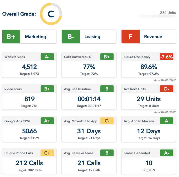
It's hard not to notice the big, glaring red 'F' this 280-unit apartment community has in its revenue category. It also has two below average grades in both Future Occupancy, which is 7.6% below target, and available units with 29 when its target should only be eight.
If you start with the marketing portion of the monthly report and work your way through each data point, you can begin to understand what might be causing the low grade. Determining whether the ‘F’ in this example indicates a problem isn't so obvious.
The community is seeing above average numbers in website visits, video tours watched, and Cost-Per-Minute spent on digital ads. The leasing staff is doing a good job both answering the phone and in handling those important conversations. And, surprisingly, the community did generate more leases in the last month than the target average.
But why do they still have so many available units?
The amount of unique phone calls coming into its leasing office is interesting in this example. This community's grade is below average, which is odd given how well its marketing strategy worked in the last month. Because it's getting a strong number of highly-qualified visitors engaging with the content on their website, you can assume that it also should have seen a higher number of phone calls.
This most certainly is indicative of a pricing problem. The apartment community had no problem getting the attention of prospective residents, but they're not converting to a phone call because they're balking at the high rent prices. A price adjustment would significantly improve this community's leasing because it clearly has the demand needed to fill units quickly.
Case Study No. 2
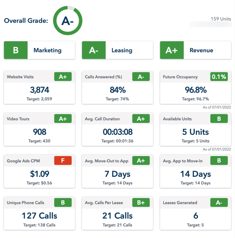 Though this community's Google Ads Cost-Per-Minute is much higher than average and has been flagged with a low grade, it's not hindering website performance or leasing activity in any way. (The leasing staff is firing on all cylinders, too. Look at the Average Call Duration!)
There's two main things we want you to takeaway from this specific case study:
-
- This is an example where having a lower grade in the monthly report doesn't mean you have an issue or are doing something wrong. The 'F' in this example just means that their Cost-Per-Minute is much higher than target.
- The other thing we want to point out is you'll notice that the Average Calls Per Lease and Available Units metrics both match their targets, yet they are graded with just a 'B+' and 'B', respectively. Consider being on target as being average when you review your own report.
Conclusion
At its core, the new version of the RentVision monthly report is meant to show you how your apartment community's marketing, leasing, and revenue performance compares to your peers. The added letter grades aren't meant to tell you if you're doing a good or bad job, they are designed to help you contextualize the data so that it's much more informative. You can always dig deeper into your data and other performance metrics by logging into your RentVision Platform account.
One final disclaimer: RentVision partners with corporate sites only will still receive the previous version of the monthly report. Also as previously mentioned, the Revenue column of the new RentVision monthly report will not appear for communities that do not have the Future Occupancy integration turned on.